
Please read Screen Printing With Natural Inks (pt1) before this post to follow the work up to this point.


Monday, I had all day booked in the Printmaking Workshop (PMW). Shared the space with Andrew Bracey, who was working on a letterpress project. Felicity Shum was the assisting technician for the day.
Focus:
– Test the Bitmap/Halftone screen.
– Print 6 panels of varying cotton fabrics for use in work.
– Pull some extra samples from the test screen.
The Bitmap image of the Walnut Torus had been exposed onto a 90t screen on Friday. 90t screens (yellow mesh) are usually for finer work on paper, therefore it was felt that the Bitmap would perform better on this screen even though I was working onto a textile substrate.
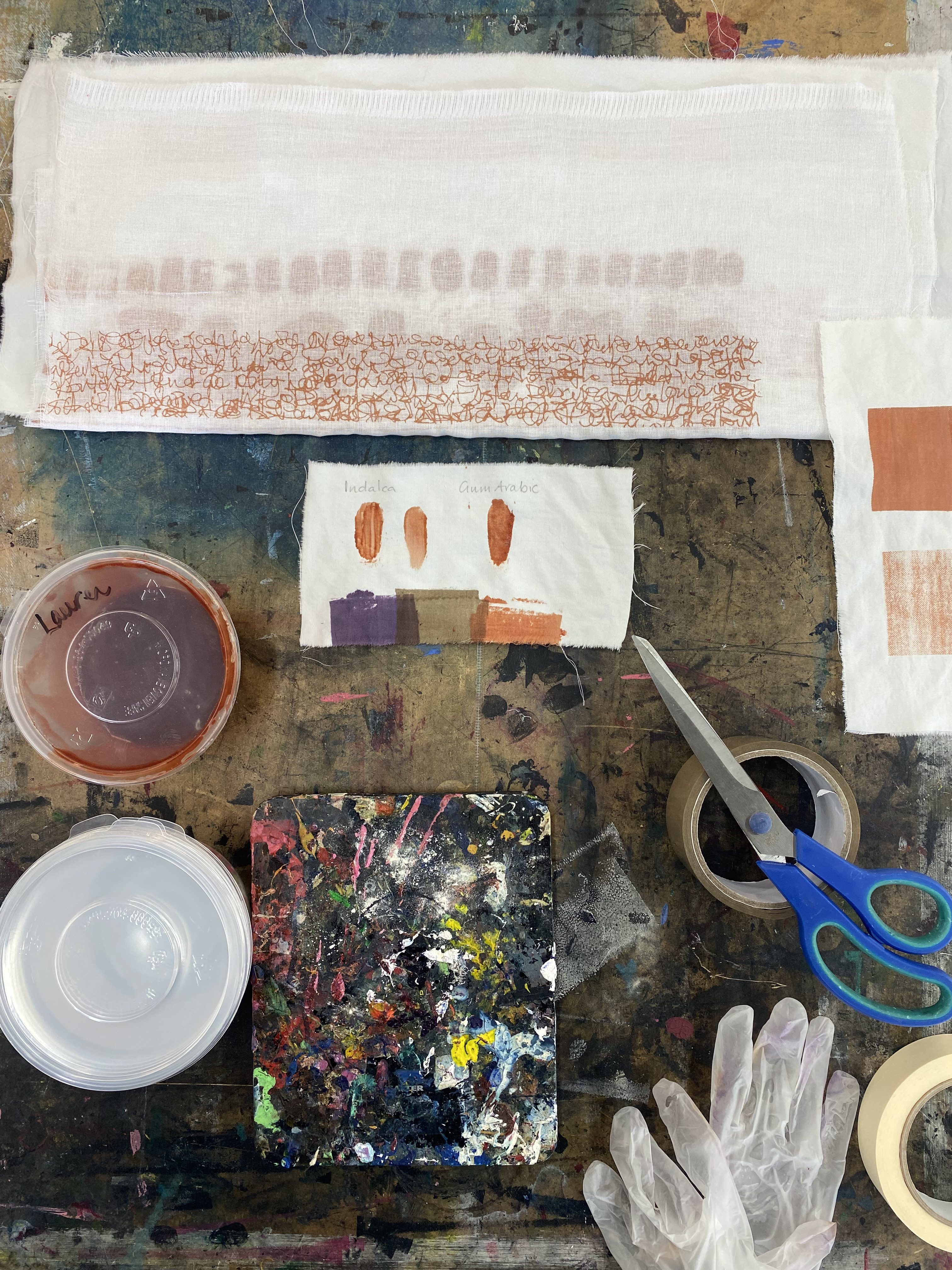
After ironing the 6 panels I secured them to the table with masking tape, prepared the screen with a packing tape border and mixed the remaining Madder/Indalca ink. There was not a lot left in the pot and very little in the jar to make more, so I extended the volume with some water, thickening the mix with extra Indalca powder until it reached a ‘custard’ consistency.
My first pull was a the Walnut Torus Bitmap on the 90t screen with Madder/Indalca. I pulled a flood and a print to avoid losing the detail (as we found in Friday’s test swatches). It did not result in a strong image at all. It felt like the ink was almost drying on the screen and not much was passing through. Dissappointing.
I tested another pull – this time a flood, followed by three print pulls. Very little was passing through, so we abandoned this attempt and quickly washed the screen out to avoid further drying up. The screen washed easily which led me to believe it was not, in fact, drying too quickly. We therefore tested the ink through the test screen, which is on a 43t (textile-white) screen and it printed beautifully. We tested the ink again through a borrowed design that was open but on a 90t screen to see if it was the thread count affecting the print. This too, printed really well. I concluded that the combination of Bitmap, 90t and natural ink was too much for the image to print successfully.
With this in mind I decided to wash up for the morning, as I had a PRAC meeting to attend on TEAMS, I could then return to my Photoshop images and choose the solid black torus options instead of the Bitmap. In addition I would expose this on to a 43t screen to ensure the best results onto the cotton fabric, especially as I had a couple of pieces that were onto a thicker and courser weave.
In the MAC LAB, I selected two torus designs to print. I need to select the plotter printers so I can print at A2 and it needs to be on lightweight paper – not usually installed in the printer. Once printed I took them back downstairs to the PMW to expose the screen. FS and I decided to expose both images onto a larger screen, so that I could have options. One image was the Walnut Torus as before, and the other was an Acrylic Paint Torus. Both came out really clearly on the screen.
The first test print was on the plain white cotton, and it printed really well. The colour saturation was good and the image edges were sharp. The next pull on some medium weight calico was less sharp, but this was due to the substrate and not the image print itself. I like the texture, however, so I think it will be a useful piece.
After washing out the screen and leaving it to dry, I decided to use the last of the madder ink on a test screen pull onto some small pieces of cotton. This would give me some pieces I could use in fabric collage elsewhere in my work – possibly in the Kantha Quilt piece. I enjoy having links and common threads between my pieces, sometimes even from previous series of work. It is as though the story flows through from the early work and into the newest work, as knowledge is built upon rather than discarded and begun afresh; so the making, doing, knowing and seeing is built upon in my work. The road travelled is clearly visible from this current place.
I switched ink colours to the Logwood/Indalca (aubergine) mix and then again after to the Knopper Gall/Indalca (dark brown) mix. Both inks performed well, much as the madder did. I would say if anything the Logwood had a lumpier consistency, but this smoothed out well as it was used through the screen. I could think of sieving the ink before use, but because it works well on the screen and continues to smoothen as it is used, I see no point in adding this extra step, with additional equipment to wash up.
Last tasks of the day were to wash everything up thoroughly and place all prints on the rack to dry. I will wash some of my test swatches at home to see what happens to the prints when washed – I am looking to see if this improves the handle of the fabric, which stiffens with the ink somewhat when printing. I do not want to lose the image in anyway, so I need to test the cost/benefit of this step before trying it on all the main pieces. A softer handle will help with my ability to sew into the fabric successfully.