
Led by Karoline Rerrie at Leicester Print Workshop
1 – 3 February 2025
Saturday arrival at LPW, found that three courses were running on this retreat. Screen printing, Mono print, and Book making. Our course had five participants, Chris (another member of LPW like me), Claire, Clive, Fiona and myself. We were a mix of complete beginners to the process and emerging practitioners.
Karoline demonstrated the processes she wanted us to use. She showed a ready exposed screen with an A4 sized window and another with torn paper strip apertures. she produced solid backgrounds with the A4 window, and then layered these with contrasting coloured textures from the paper strip side of the screen. By offsetting the registration she showed how different colours (especially those with transparency) interacted together on the background.
We learnt how to coat our own screens using a trough and screen coating. The screens then had to dry in the cupboard for up at least 30 minutes. While they dried, we created abstract shapes with black paper and placed them onto acetate sheets. We also chose objects that could be laid flat onto the acetate to create different sillouhettes.


She also demonstrated how she could add paper stencils and masks onto the plain window to add different imagery and texture to the piece.
These acetates were placed onto the glass of the exposure unit, face up and the coated screen was placed screen side down on top of them. Closed quickly to avoid light exposing the screen, we then locked the unit top, pressed the vacuum button and set our exposure to between 15 and 20 light units. Once the vacuum has fully sealed the screen, we pressed start and waited for the exposure to complete.
The next step is to take the screen immediately to the wash out room – again avoiding unwanted exposure to the image area. With the jet wash we removed all of the unexposed areas of the screen (that which was covered by the objects or the black paper. The exposed coating is hardened and stays in place on the screen. Once fully washed out, the screens go back in the cupboard to dry off again.
We mixed paints ready to print. There were a variety of colours in both opaque, semi-transparent, and transparent. These must then be mixed 50/50 with a screen printing medium so that the paints don’t dry out on the screen too quickly, creating blockages. I decided to stick to process yellow, process magenta and process cyan for my first print design. I began with the yellow, which I later learnt was not necessarily the best colour to start with as it can get lost on white, but I think it worked well enough for this print in the end.
When screens were dried, we attached them to our boards with the clamps and set up our cadfoil registration sheets under the screens. We took a first print onto the cadfoil, this then allowed us to place our print paper under the cadfoil image to place the paper exactly where we wanted it. We could then place masking tape registration marks down so we could always place the same sized paper back in position each time. Often I preferred to use the cadfoil image alone, as I could play around with offsetting the image uniquely for each print.
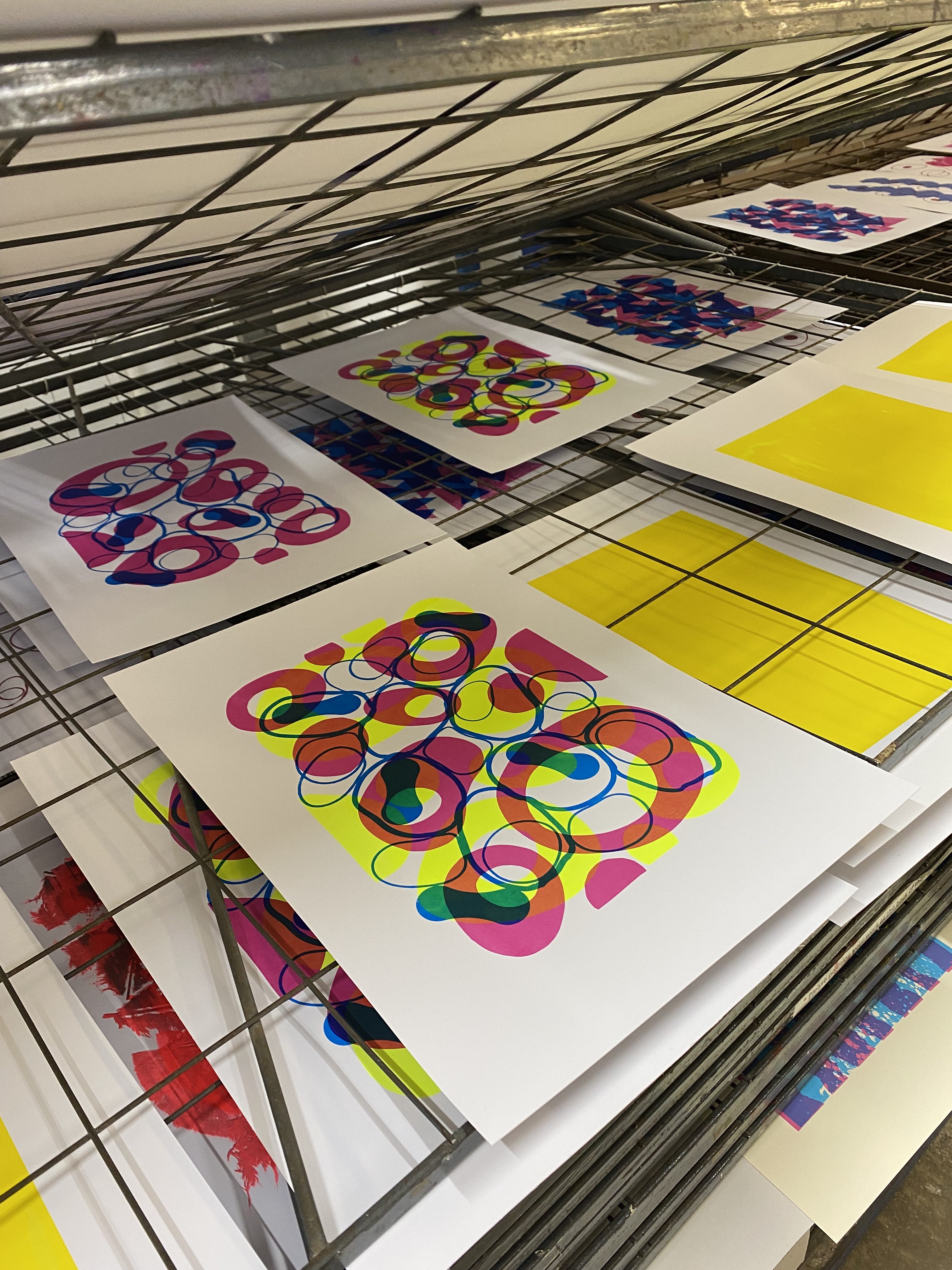
My first print was in the process yellow – this layer was registered the same for all the prints. I took an edition of 6-8 prints. It came out neatly and I was pleased with the colour. Next step was to allow prints to dry and wash out the screen immediately. This is important as paint left on a screen can dry out and block the mesh. For the same reason it is important to “flood” the screen with ink after each print so that the mesh stays moist.
After the prints and the screen was dried again, it was time for the next colour. I went for the magenta this time. This was when I learned why it is important to mix your colours with screen printing medium. I failed to do this and set up my first print with unmixed paint. The paint was very thick and sticky to pull and the print looked terrible patchy and unclear. As soon as I realised my error, it was a race to get to the wash out station and rescue the mesh before the paint set. I got away with it but it held me up as I had to wash, dry and register the screen all over again! The difference in the prints after correcting my error was remarkable and I learned from the experience.
I enjoyed making this second layer on top of the previous yellow layer as where the two colours overlapped, it created an orange, giving the prints more complexity than the original screen design. It almost had the effect of sun catchers in a window or stained glass. I made sure to print a couple of magenta layers on their own as a variation on the design.
Lastly, I made use of the Cyan and the second design on the screen, created by laying various sizes of rubber bands to the acetate and exposing the screen on top. I really liked the organic shapes and lines it produced. I printed this image on top of the yellow and magenta layers, but also created some on their own. This led to repeating the print with another colour, created by adding titanium white (opaque) with the cyan for a paler shade of blue. To print I flipped the paper around 180º so that it contrasted with the original registration more.

Reviewing our work together at the end of the day, Karoline gave me the challenge of bringing in more texture in my work. All my prints produced solid, clean shapes, so she suggested I look for items that would create texture when exposed on the screen.